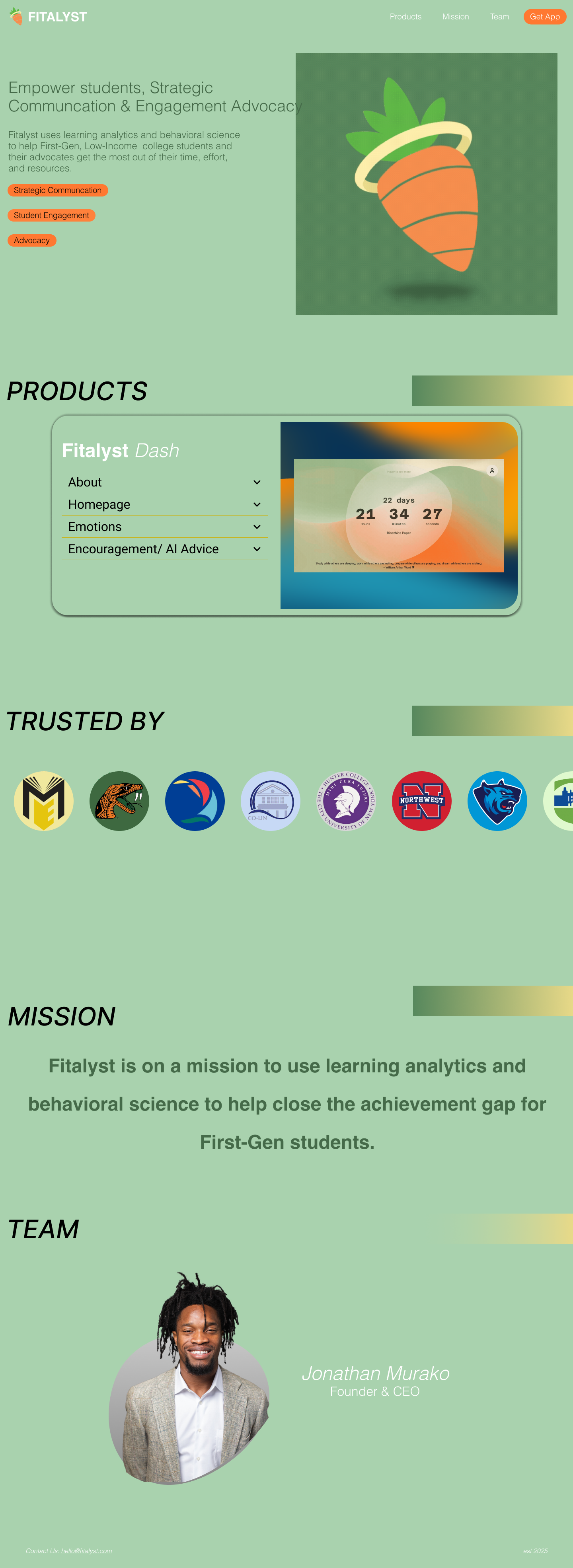
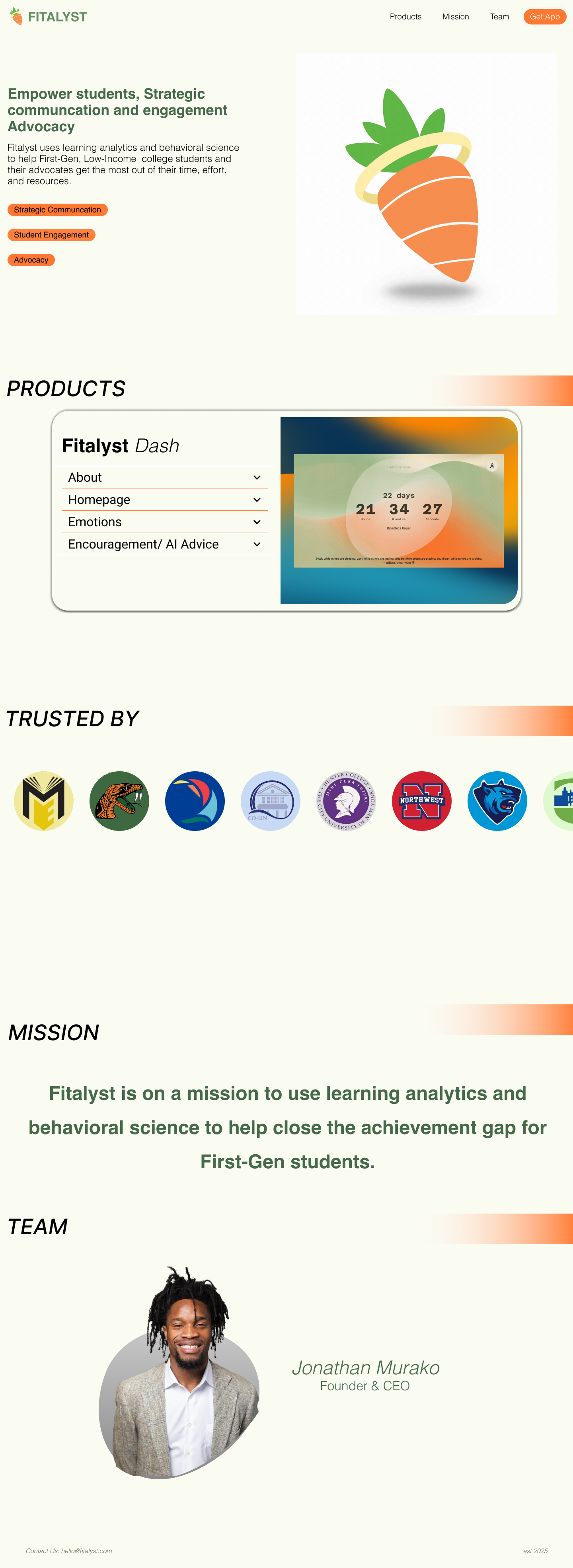
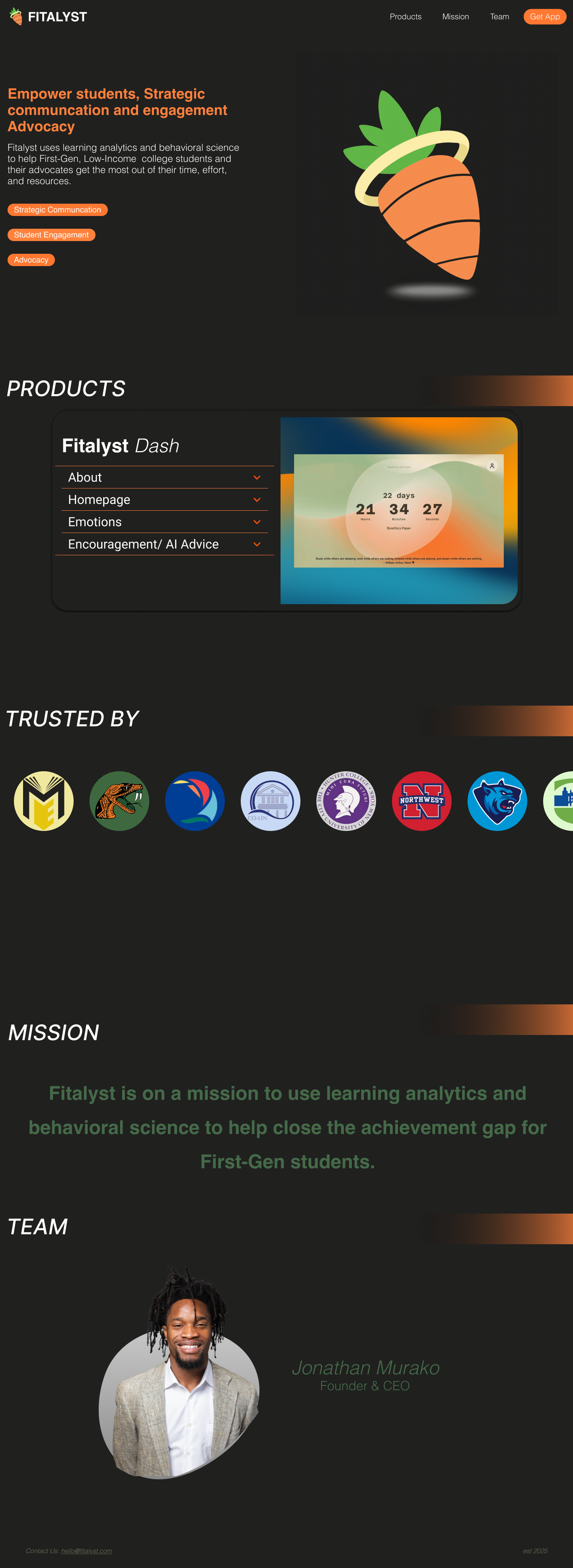
This UX/UI case study showcases the landing page for the startup company Fitalyst. The project involved user research, product research, competitor analysis, motion graphics, and branding direction to match the product Fitalyst Dash more with a landing page that better represented the company, and was manageable enough to update as more products are made and released. The overall goal was to make the landing page clear, concise, direct, dynamic and immediate functionality.

The Problem
The existing landing page experience for Fitalyst lacked an intuitive user flow, product differentiation and explanation, and hierachy of information, resulting in
Unclear Goal and Product
Low User Understanding
Drop-offs before getting to product showcase
The Design Journey
Having done work previously for the product Fitalyst Dash I had the necessary information I needed for the basis of my User Interface, and design system.
1. The Design System
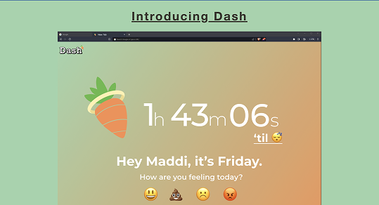
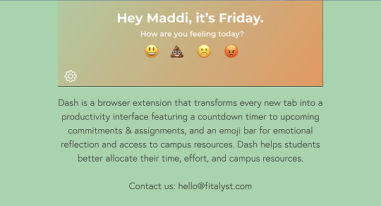
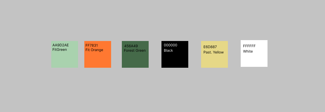
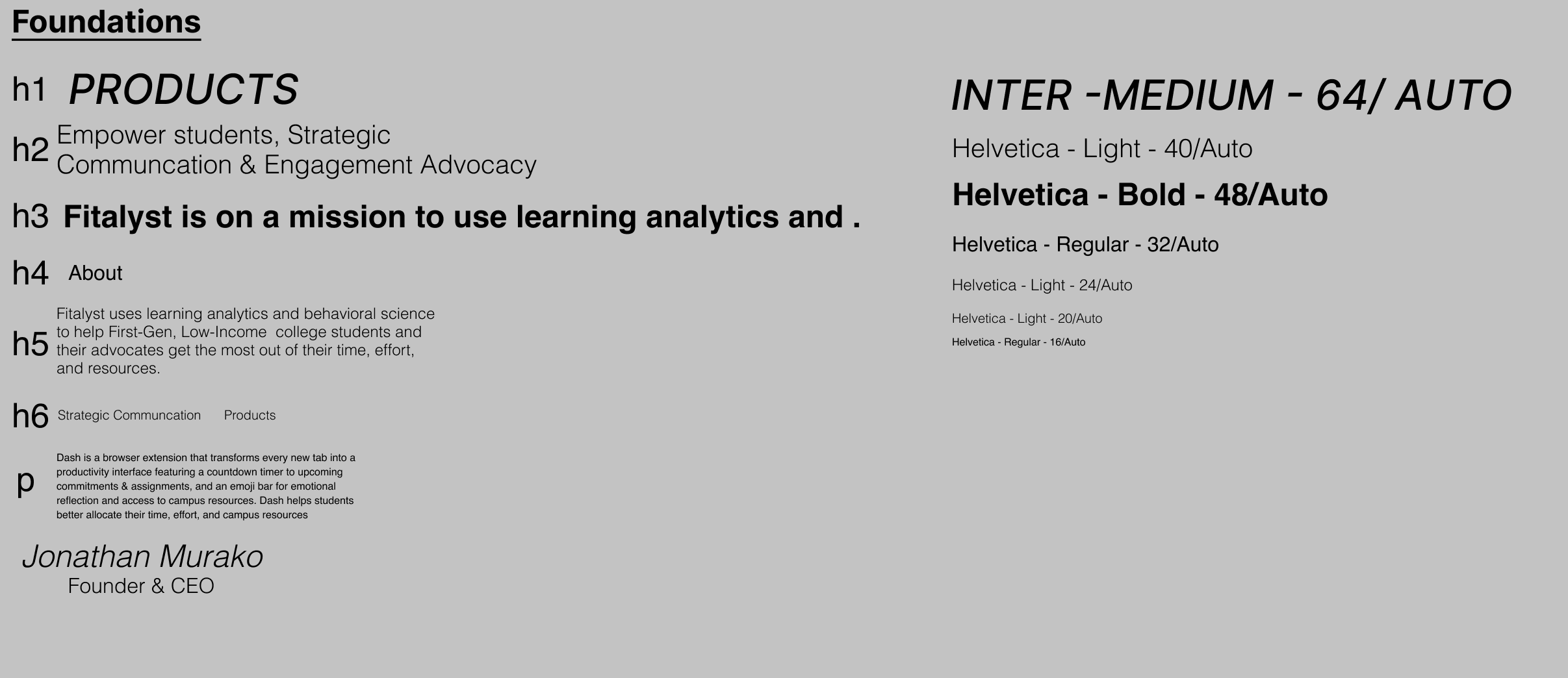
I was able to use the product built before as a reference for my colors and typography.
The product wants to be easy to read, clear to understand, and as welcoming as possible so many open sans, default typefaces were chosen for the product. I decided to stick with that trend, along with the colors from the product
2. Project Goals
Create a clear, concice, direct landing page
Build a dynamic, functional site that could scale as Fitalyst grows
Inform users with accurate, in depth information on the company and products sold
3. Wireframes & Low-Fidelity Prototypes
Iterated based on owner and previous web user feedback
Focused on modular design system with reusable components and structured CMS collections, reducing update time and ensuring consistency across pages
Inspired by other streamlined technology/ software companies landing sites
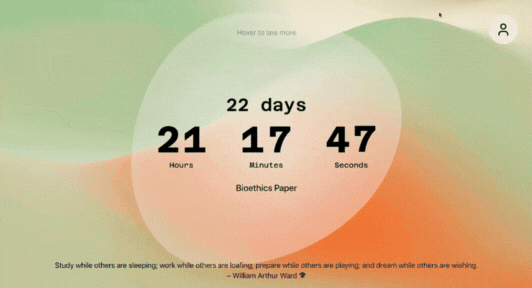
4. Components and Prototyping
Developed the components needed for the hi - fidelity versions of the site
Built scalable UI components in Figma, including:
CTA Buttons
Accordian Product cards
Carousel Images and Flip Cards
Components:
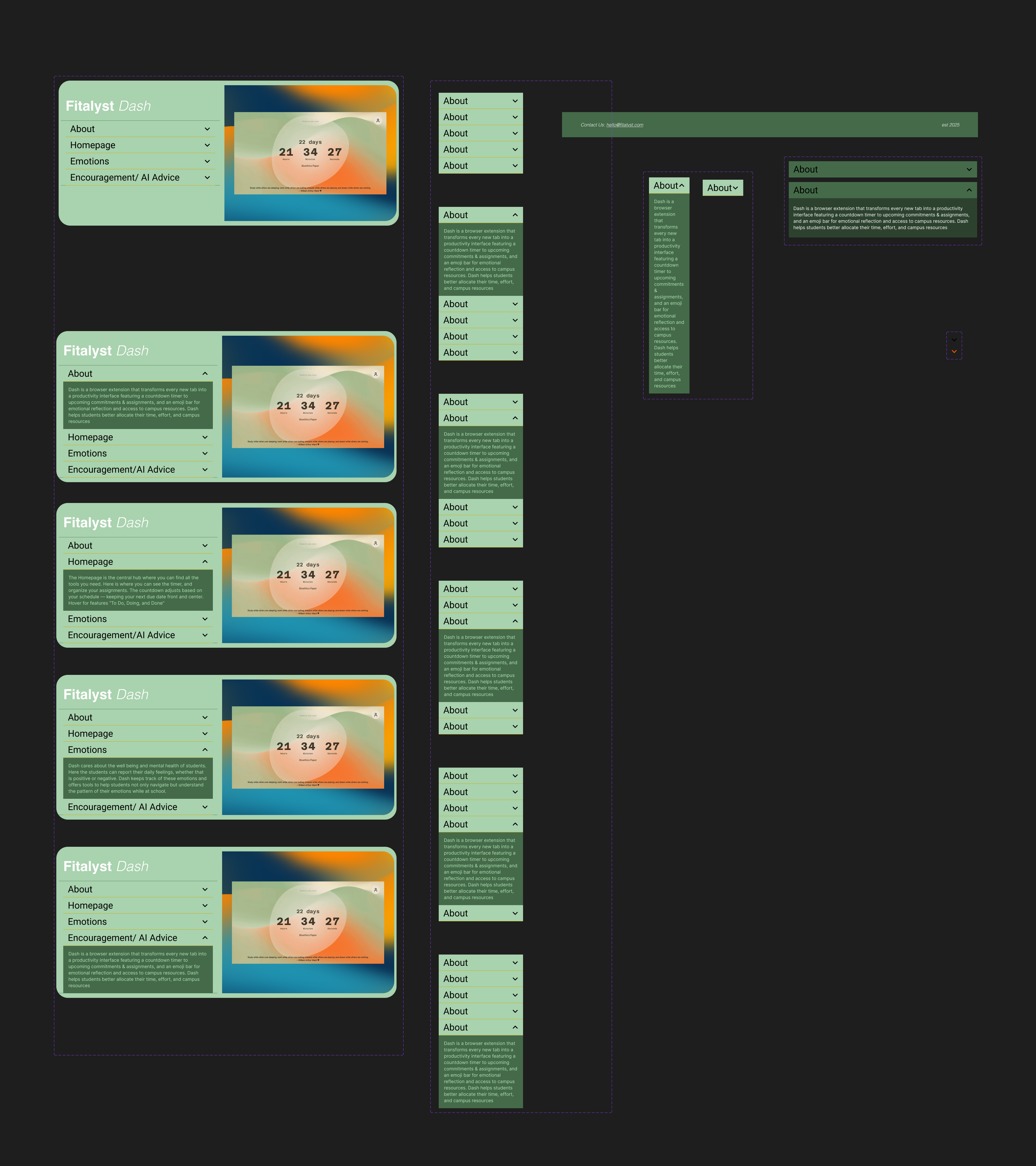
Prototypes
Final Thoughts
This project helped me expand my technical skills in Figma, and Webflow, and learning more advanced techniques with CMS, Prototyping, and better user experience practices. Additionally, it was interesting, and insightful being in a more general designer role as I was responsible for the multiple parts of the user experience from coding to, prototyping, visual design, ux research, and ux writing. It was also a great experience seeing the entire production from research to launch.